Medicine
reminder
App + Website
THE PROBLEM
The main problem is combining reminder app with users’s low technological skills.
PROJECT GOAL
Easy-to-use app that can suit user behaviour and skills. Allow a external support to interact with app.
MY ROLE
UX/UI Designer. Conducting interviews, paper and digital wireframing, low and high-fidelity prototyping, conducting usability studies, accounting for accessibility, and iterating on designs.
USER
RESEARCH
SUMMARY
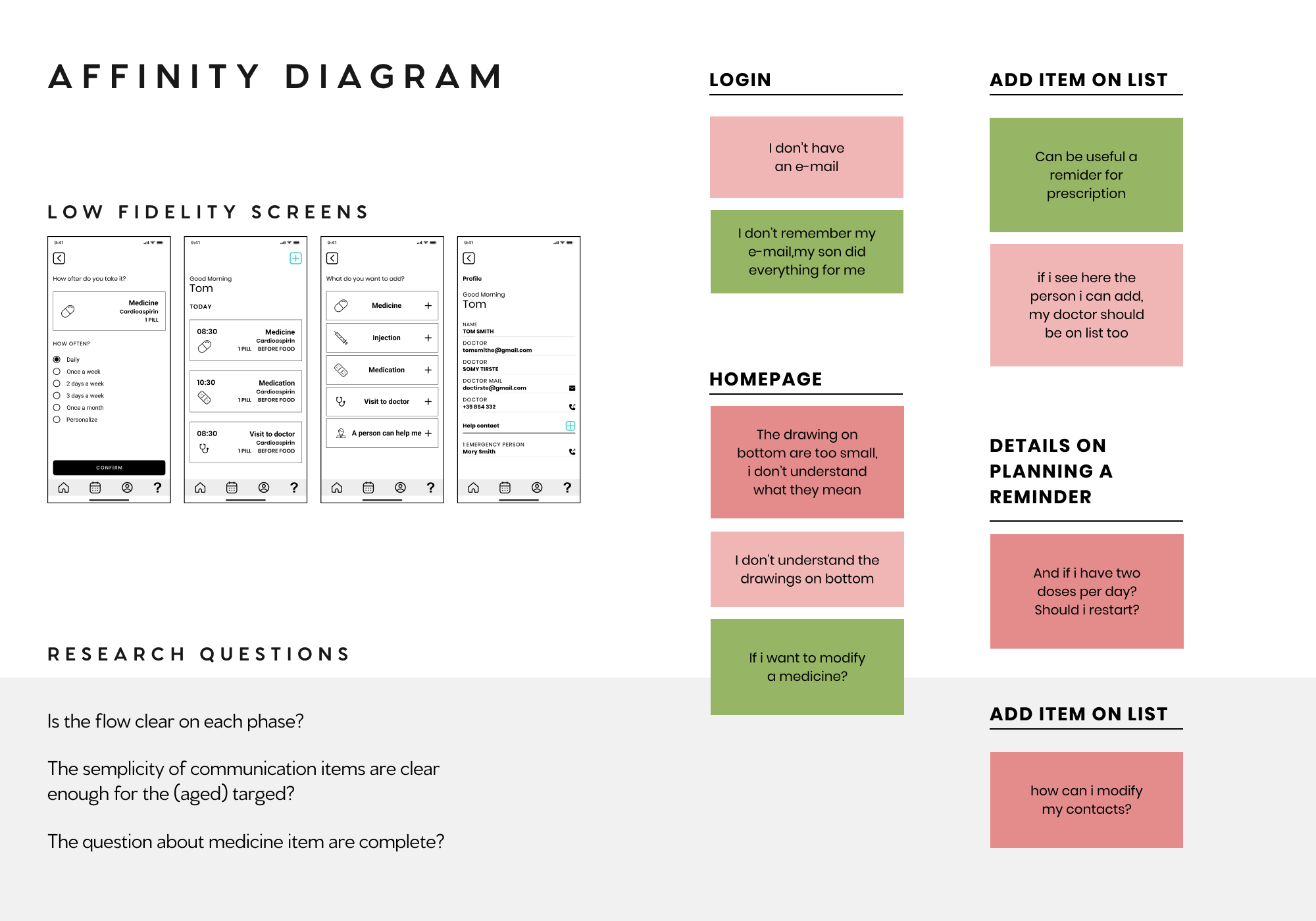
I conducted interviews and created affinity diagrams to understand the users I’m designing for and their needs. Usability test based on time on task, conversion rates and SUS for both App and Website.
- PAINT POINTS
- Forgets to take medicines on time
- Take wrong medicine
- No support for using reminder apps
- Long list of medicines and medical appointments
PERSONAS
AFFINITY DIAGRAM
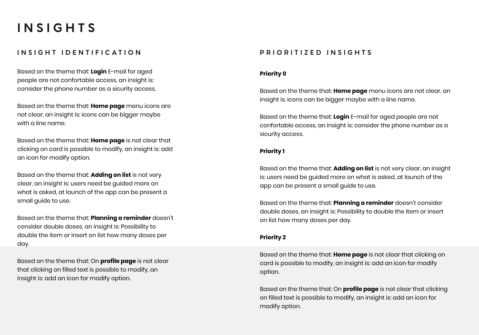
INSIGHTS
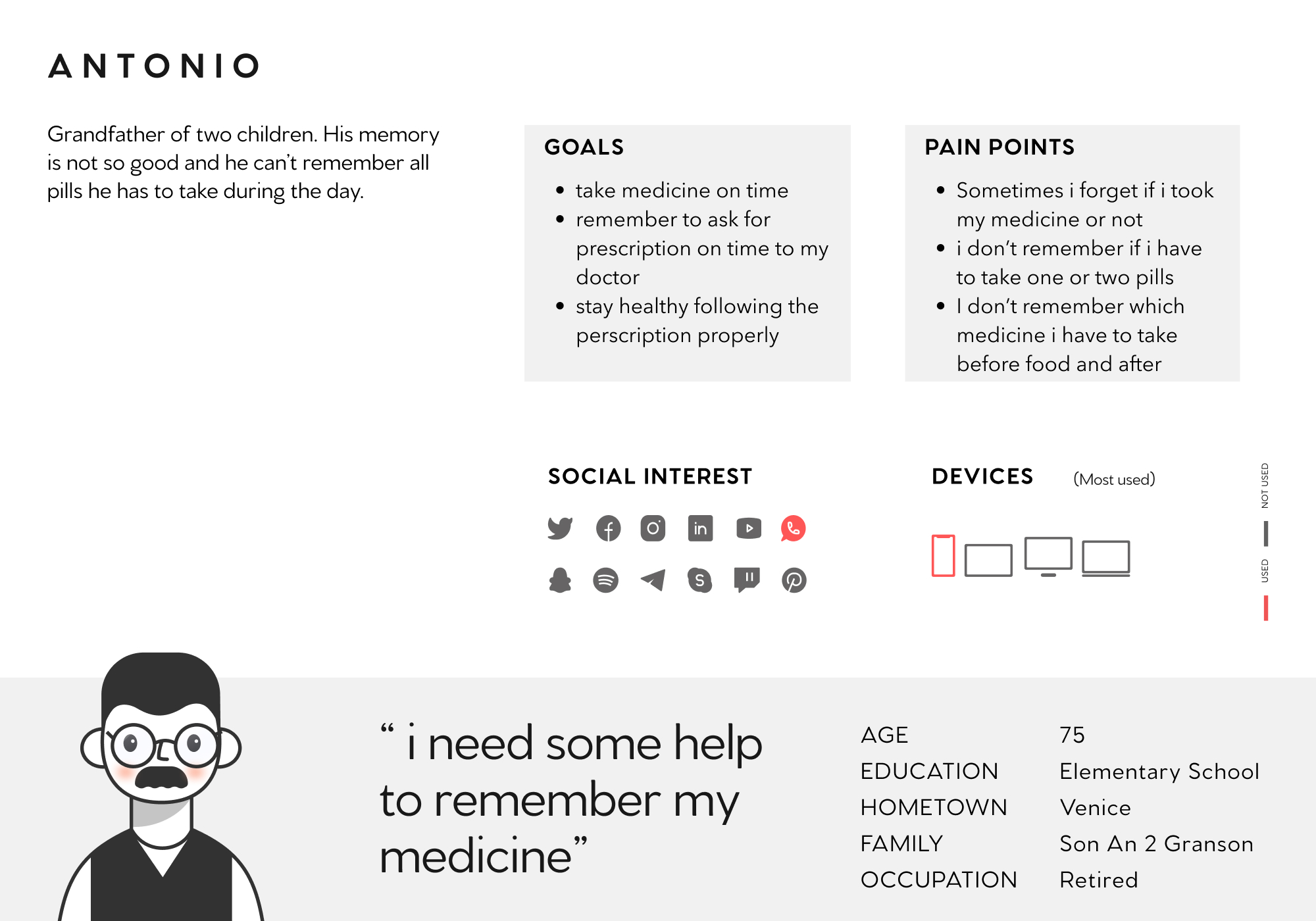
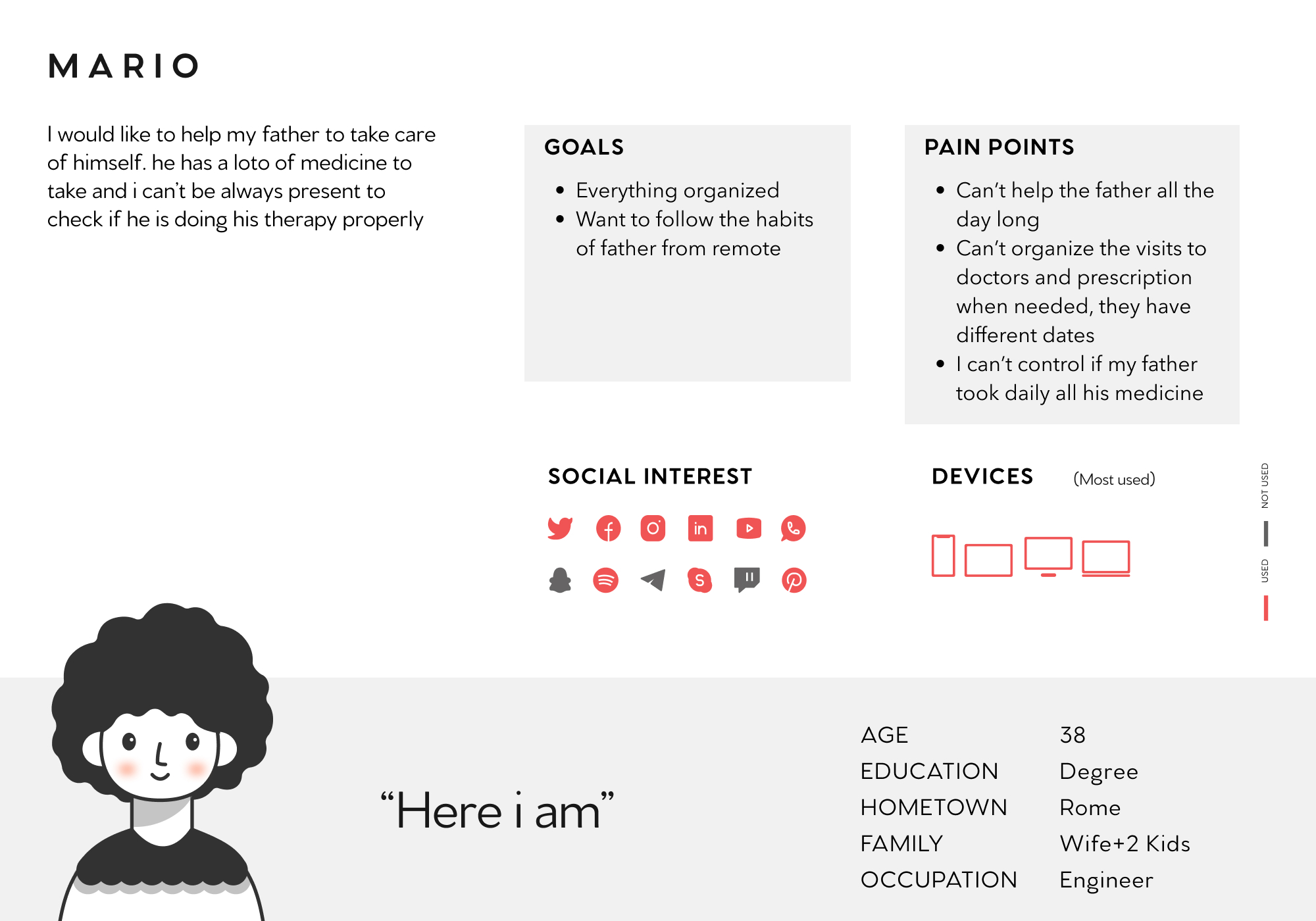
For this project i identified as the main user, Antonio, 75 years old with not great technological skills and Mario as a secondary user, 35 years old who can create technical support for the use of the app.
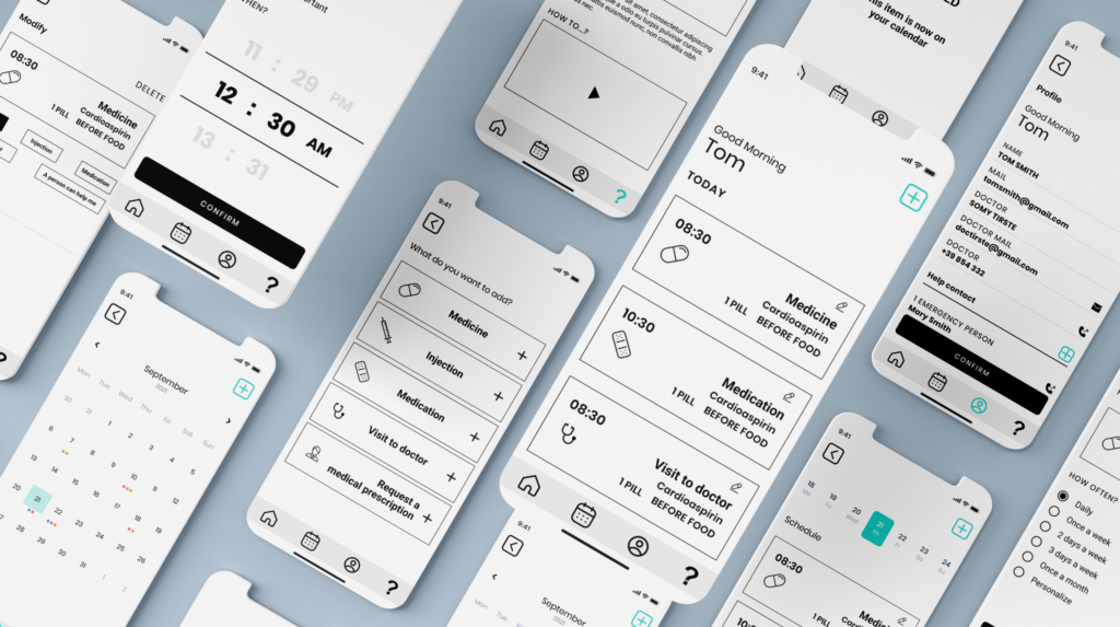
WIREFRAMES
Easy-to-use structure, the challenge was to make the flow as simple as possible while giving the necessary information for the correct use of the medicines.
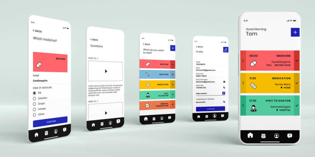
HI-FIDELITY
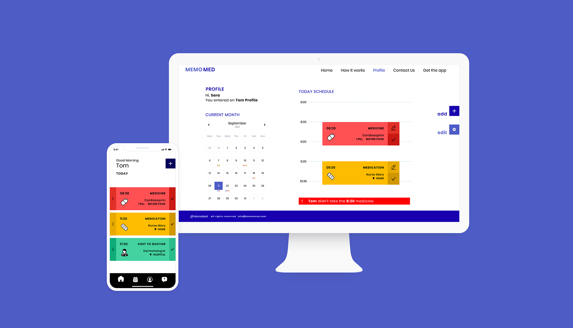
The visual project tries to respect accessibility and high readability of the contents. The colors are important to easy differentiate items and activities.
CONCLUSIONS
Color was tested to respect accessibility standards, language choice to allow everyone to use the app, alerts and detailed infos for allergies and filter to make easy the choice of plates
“Easy to use”
“It allows to see where the truck is also if i want to order for another day”
“Clean and easy”
Add visual details, continuing studying other competitor to understand pain points
