Florist
responsive
website

The digital experience of online shopping very often does not reflect the attention to detail and personalization of the product sold.
Create an e-commerce store that allows the consumer to experience the attention of a local florist shop
Conducting interviews, paper and digital wireframing, low and high-fidelity prototyping, conducting usability studies, accounting for accessibility, and iterating on designs.
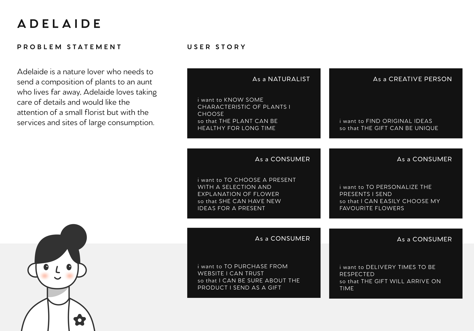
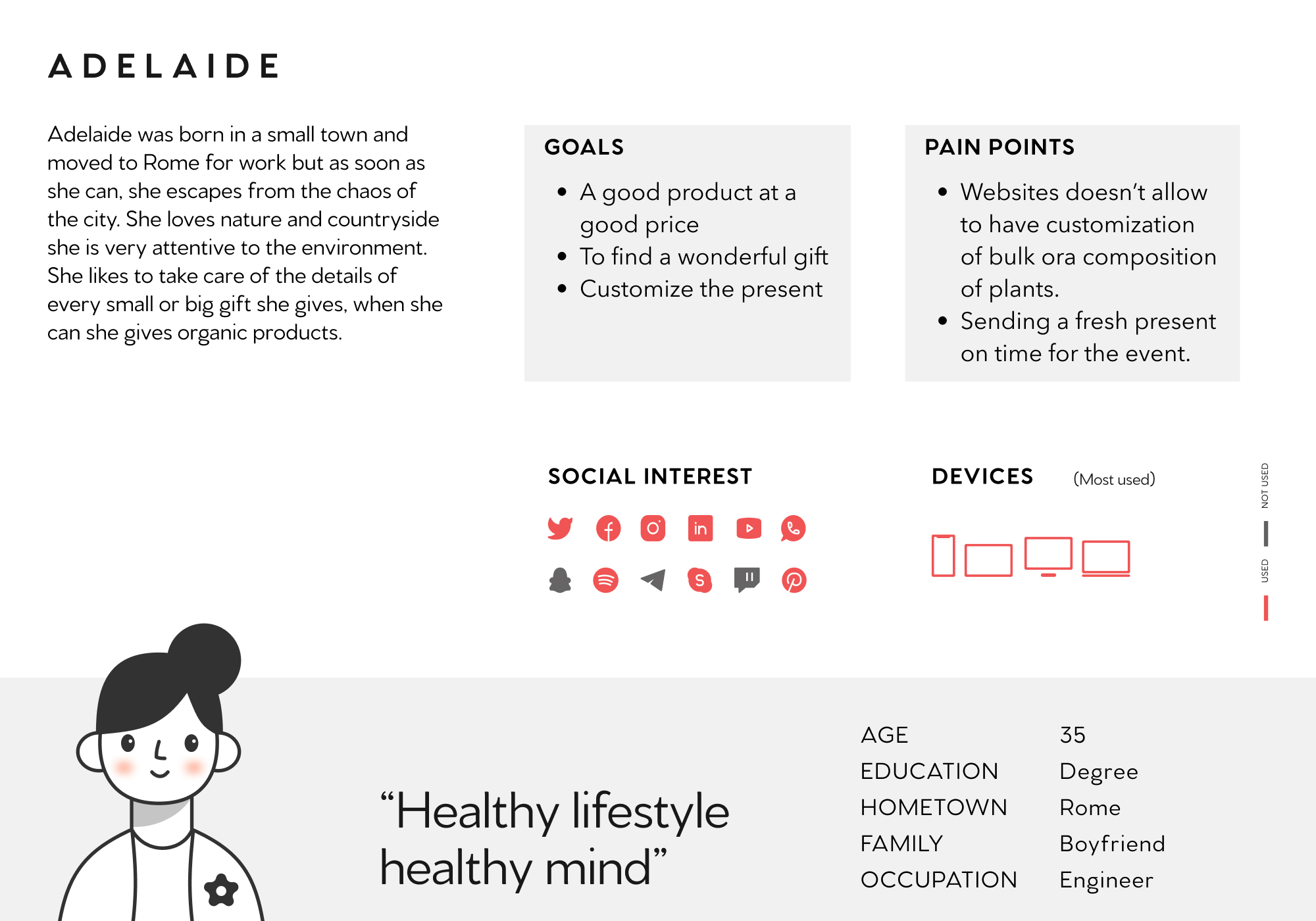
PERSONAS &
USER JOURNEY
I identify the personas that the website was going to service and create a scenario to create a user journey.
WIREFRAMES
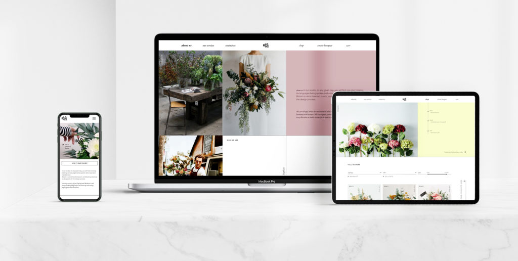
The site’s structure is organised with a sticky top menu. Home page gives a previous overview of all the internal pages for a fast and direct access.

HI-FIDELITY
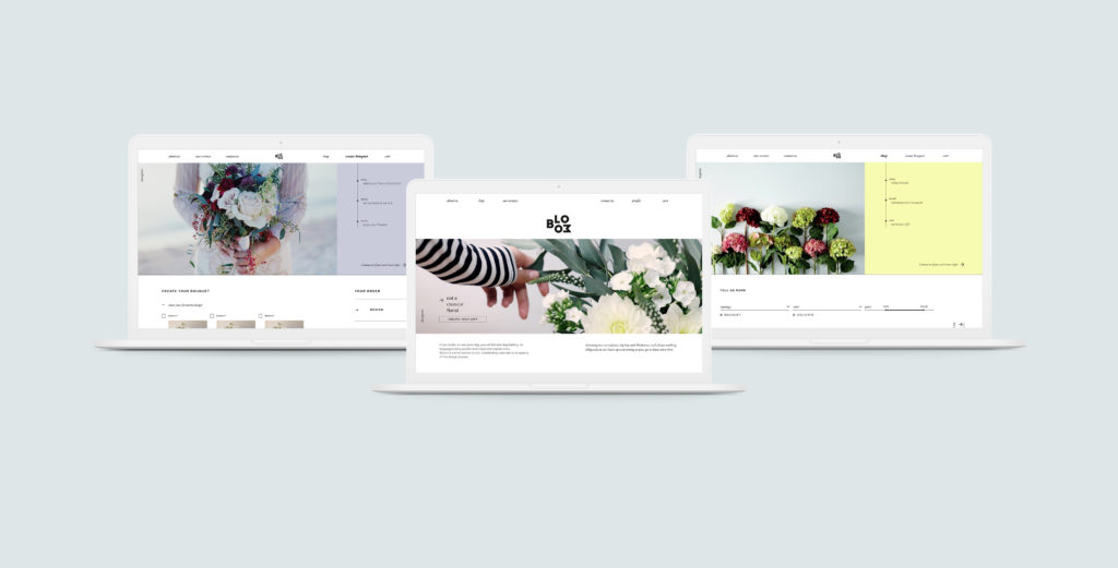
The visual design choices represent a simple and linear style. The choice of images and colors want to take back a fresh and young atmosphere.

CONCLUSIONS
Color was tested to respect accessibility standards, language choice to allow everyone to use the app.
This site would need to more suggestions for a perfect combination of flowers on “create your bouquet” page.
Chat support will be a good feature on this site. Focusing the website on quality of the product a support option would be personal and suitable.

